Colin Owens, MFA ’09
project
ShapeMix is the project I created as a testbed for several theories of audiovisual exchange. I wanted to create a place where one or more audiovisual objects could live in one space and be manipulated.
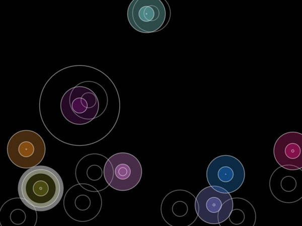
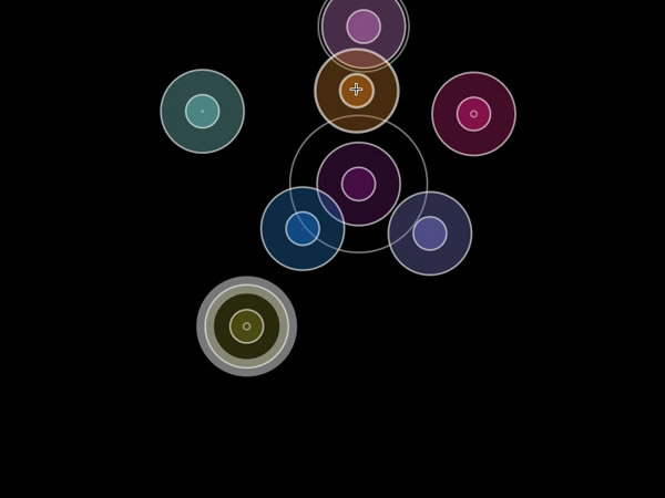
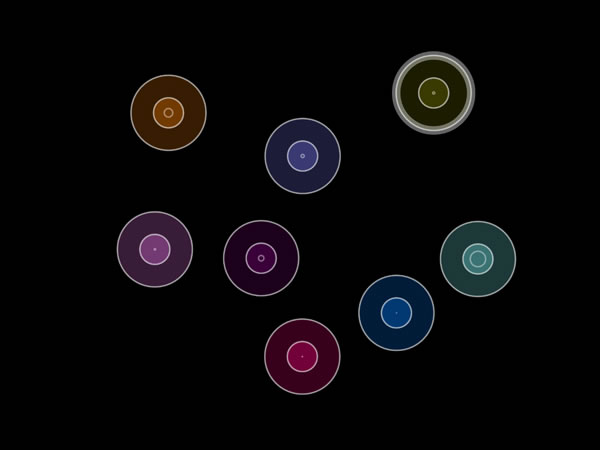
At the heart of the project is the notion of a confined space that represents left and right/ pan and up and down volume. each of the shapes (circles in this case) represents a sound. Inversely, each sound represents a shape. The two are synonymous. Each of the circles can be manipulated with sonic and visual effects that give
audiovisual cues.
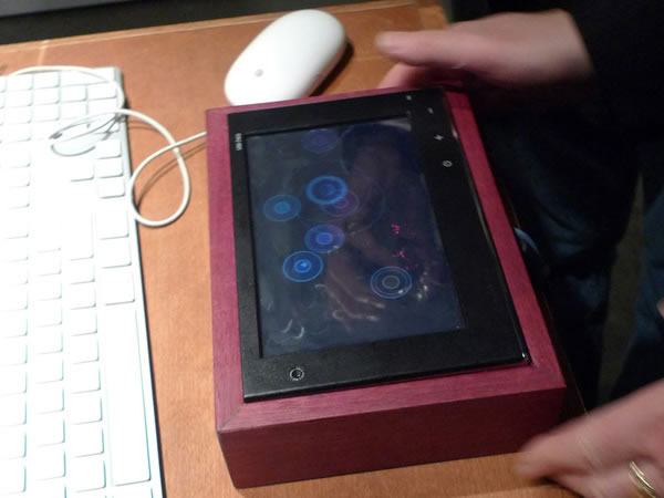
I wanted to create a flexible software interface with an eye towards portability and ease of use. For the gallery show, I created a small touch interface on a screen inside of a box with an accelerometer inside. Because of the small size, the user could pick the box up and shake the shapes around. This probably could be done with a larger table, but I doubt it would have been easy to pick up and move around!
Several early experiments led me to the creation of the fully working prototype.
Beat Detection
I started working with a library based on Frédéric Patin’s algorithms for detecting sound energy peaks. I took several recorded tracks from the same musical piece and assigned them to a circle. I then had the program enlarge each of the circles according to the beat detected.
The beat detection worked very well with percussive sounds (as you would expect). On the downside, it randomly assigned beats to sounds that didn’t have as much definition. I dropped the idea of using beat detection in favor of volume data.
Pan & Space
I had circles placed in space, but it bothered me that they appeared in different places–yet sounded like they were coming from the same place. I experimented with audio pan by mapping the horizontal space of the circles in relationship to the left and right ears. One of the sounds to the far left was more apparent to the left ear. The two sounds near the middle sounded more in the center, with the one on the left leaning toward the left and the right one leaning toward the right.
Movement & Space
I had a single circle move by following the cursor. The movement of sound and shape from left to right worked well for panning, but nothing happened when I moved the circle up and down. I thought to use height as volume, making the circle bigger and the sound louder as it approached to the bottom of the screen and smaller (becoming almost nothing) when it reached the top.
Multiple Shapes & Volume
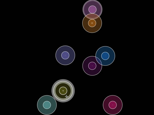
When I introduced multiple shapes, the size of the circles became a problem. Circles closest to the top would become difficult to find when I tried to click on them. Circles closest to the bottom would become difficult to locate and maneuver because they overlapped so much.
I settled on keeping the shapes the same size as one another so I could identify them as different objects of the same type. This would also make it easier later, when I would use a touch screen to move the objects around. If objects of different sizes were difficult for the mouse to locate, a touch screen with a lot larger clicking area would drive someone crazy trying to locate and move individual circles.
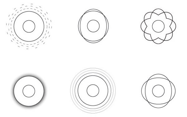
Since i didn’t want the base shape of the circle to change, I had to represent volume in another way. There were several possibilities: represent volume as a non-filled second circle emanating from the middle; use the edge of the circle as volume; or use the opacity of the circle. I didn’t want to use opacity because if I had any more than a few circles of similar base color it might get confusing. Using the circle’s circumference for volume was mathematically difficult for the computer; the presentation method too limiting and having to read around the circumference would be odd.
I chose to represent the volume as a non-filled circle emanating from the center. It was far less distracting than the other two proposed methods and it made the interface easier to use.
Physics
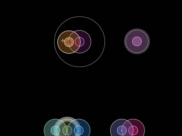
I wanted to find a way to keep objects from overlapping too much on the screen. It didn’t make sense to have two objects in the same place at the same time, since our version of physics doesn’t support two things being in the same place at the same time. In audio mixing theory it’s also prudent not to place two things in the same exact space (there are exceptions to this rule).
I adopted some simple physics principles of collision detection and separation. In addition to keeping the circles apart, I opted from them to “spring” or repel away from one another, like when you put two magnets with the same polarity near one another. I turned the whole space into a “box metaphor” so that the circles wouldn’t pop out of the side and end up on the other side abruptly. I applied a simple gravity that, when turned on, would make all of the circles fall to the bottom and bounce like super balls.
The direction of volume had to change at this point. Up means volume-up and down means volume-down in audio mixing. In physics, rest means silence. When the volume was changed so that the bottom meant silence and the top meant full volume, it made sense because objects at the bottom didn’t have any movement attached to them.
Later, I added an accelerometer that, when place on the bottom of an LCD screen laid flat on the table, would bend gravity in different directions, depending on which way it was turned. It reminded me of lifting a pool table and watching the balls fall to the bumper. This effect helped in instances where every sound needed to be nudged up or to the left a bit.
Adding gravity, spring and collisions to the mix had some fun unintended consequences. The act of randomly bouncing balls changed the volume and pan and created its own set of effects. Using a single ball to move the one next to it helped to widen the distance between two mixed objects, creating better audio separation. This reinforced the idea that natural metaphors can extend the language of motion using sound and image in physical space.
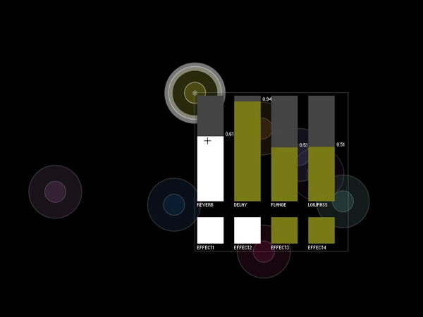
Effects
Effects seemed to have correlations between image and sound on a wave length level. Every time I came across an audio effect, I found a corresponding visual effect whether it was experienced by naked eye or on a smaller, molecular-atomic level. Panning is a psychoacoustic audio effect and the visual artifact of seeing an object in its relation to our heads.
Delay was a little more difficult to comprehend, since the corresponding audio effect was based in astronomical physics. However, looking at the theory of audio delay, it too can be measured in wavelengths. This formed the basis of the edge effect, or effect based in levels much smaller than we can see translated to our naked eye as audiovisual correspondence.
Conclusions & Hindsight
If I want to extend this language, I will have to spend some considerabletime analyzing and testing each effect type image and light analogy.
I realize that both the research and the software environment are just in their infancies. I could create a set motion studies to look at the effects of a Doppler effect on the pitch or arc motion of a shape. I could look at the elasticity or rigidity of shape as a way of giving cues about sound. There are many others.
There are other metaphors beyond 2D space. Video could be used in place or along with shape to give a sense of space to both the sound and video. The ReacTable Environment could help give tactile feedback using physical markers on the screen that act as distinct objects. This could be useful in low light situations or with people with vision impairment. A true 3D space could give way to a totally immersive environment, however, until we invent a true 3D projection system, this is not possible.
This work was made possible with the computer, but its usefulness as a tool is limited. The mind is a much more powerful tool. The computer is merely a vehicle to enable the theory that there are connections between light and sound waves and that we behave in particular ways in space.
Keywords: audio effects, audio mixer, audiovisual, sonic visualization


